RESIDENTIAL DESIGNS
HOUSE 1024



HOUSE 993
Vaal de Grace
Vaal


HOUSE B
SAVANNAH COUNTRY & WILDLIFE ESTATE
Klerksdorp
Read More
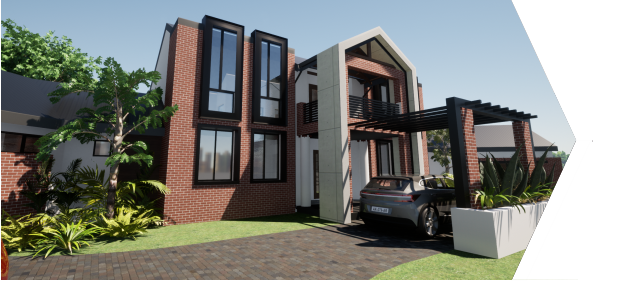
A similar design approach to House Demetriou was followed seeing as both designs are situated in the same estate, Savannah Country and Wildlife Estate. The design brief was to keep as many of the large trees as possible, which created the opportunity to place the design behind a large grouping of trees which creates a natural privacy screen from people passing by as they enter the estate.
The client wanted a complete open plan ground floor that was spacious but still compact to an extent. Entry was to be celebrated. As it is only himself and his wife, he wanted a comfortable house to stay in, easy to entertain friends and family, but also keeping in mind a high resale value in the future, in essence a luxury house. In contrast to House Demetriou, the client wanted all the main bedrooms on top at first floor level, together with a pyjama lounge. The balconies had to be spacious to open-up to the beautiful surrounds.
The entrance to the house is on a double volume scale with a lowered porte cochere. The porte cochere is skeletonised to play with rhythm and light, echoing the trees that hide away the design as one enters from the North. The Northern façade is designed to be open and permeable, to pull in the nature in front, blurring the thresholds. This connection is amplified by raising the entrance two steps high, to enter over a koi pond with the main floor slab and glass window protruding over the water with a recessed lighting detail.
To create a floating effect and to make it look like the house floats/rises above the tree line, strong vertical lines was introduced to emphasize the design’s height but also to lead one’s eyes to the very strong horizontal lines that wrap around the house, so as to spread into the landscape.


HOUSE R
TUSCANY LIFESTYLE ESTATE
Potchefstroom
Read More
The client wanted a house where they could relax and just enjoy each other’s company. The house should also be elderly friendly and accessible when their respective parents visit them. It was also needed to be able to entertain friends and family while making the most of the South African weather. They asked for a compact four-bedroom house with a separate garden cottage. It was important that it could be a lock-up-and-go design.
The client wanted an honest expression of texture and materials, utilizing a design style expression which is part of the South African vernacular incorporating clean modern lines.
A basic material pallet was chosen for the design to express the raw honesty of materials: red face brick, off-shutter concrete, diamond cut terrazzo floors, steel, wood and corrugated iron cladding. The materials chosen echo the shed vernacular found through out Southern Africa. The honesty of expression relates to design culture and heritage of the South African architectural landscape.
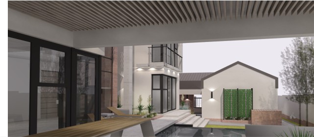
The floor plan is modular in design, keeping into account the plan width and working in increments to achieve a plan balance. The plan also allows for natural light within all the spaces through the placement of large windows, windows within the gables but most importantly through the large atrium that extends all the way from ground floor level up to first floor ceiling level and wraps up to from the roof. This atrium acts as circulation space and houses the dinning room with a concrete feature table/server. This area acts as a circulation/orientation node within the design and also provides a visual connection to the top floor.
Insulation is done within the corrugated iron wrapped over the walls as well at ceiling level. Energy efficient glass and fenestration system is used. Further solar shading is used to regulate summer exposure.
Windows are placed keeping privacy in mind but also to frame views out to the surrounding natural landscape. The entertainment area connects the living room to the infinity pool, the tranquillity of the cascading water and reflections brings a calmness to the space. The modernised pergola acts as a solar shade in the atrium, this in turn gives a magnificent shadow play at day time and a view to the stars at night. The shadow play is evident around the house design and brings a dynamic to the overall design. The material pallet highlights this as well.
In essence a high level of ordinariness was achieved using ordinary materials, planning topology in terms of utilizing the everyday shed vernacular and modernising the original conceptual understanding.



HOUSE C
WATERFALL ESTATE
MIDRAND
In conjunction with Conradie and Greyvensteyn Architects
Read More
This residence in the upmarket Waterfall Estate in Midrand, was designed with served and serviced spaces in mind. The floor plan is set out in a H/I-from with the centralised axis used for circulation and living. The house is entered from the South through a double volume entrance that is continued over the living area. To differentiate between the living and dinning area, the living area floor was stepped down and a fireplace was added to separate the space. This enables a full view of the garden form the dining room.
The flat concrete roofs are placed over the circulation areas and so doing, the circulation paths in the house is differentiated in contract to the pitched, almost pavilion like corrugated iron roofs which each hold a living function in turn of a bedroom, living areas, kitchen, garden flat and garages.
The garages are placed to the west to form a buffer to the Western sun and next-door neighbours. The garden flat is also situated here for their own privacy when guests visit. The bedrooms are placed to the east and have Northern exposure and a patio space to breath out on at the pool. There is a small atrium allowing natural light and sun into the bathroom courtyard where the client can relax in private with nature by the bath’s edge.
Keeping inline with the South African vernacular a modern take on the shed typology and material pallet was used to create this modern dwelling. Strong leading horizontal lines was used to show movement through out the design but also to emphasise the different usages of the spaces within the design. The design is stepped to accommodate the site’s natural fall but in turn used to create different layers of privacy and progression in the design.


HOUSE D
SAVANNAH COUNTRY & WILDLIFE ESTATE
Klerksdorp
Read More
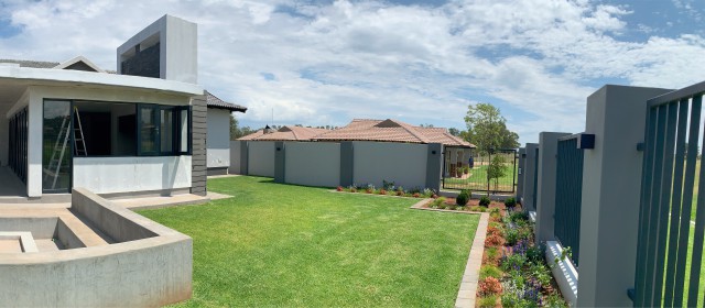
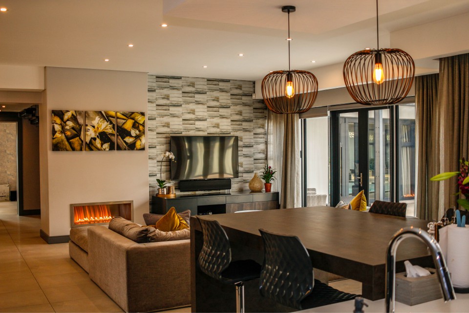
The design brief was for a family orientated house where this young family could spend time together after a busy day. A space where they could entertain family and friends but also achieve maximum privacy. They wanted a modern contemporary open plan house where it would be easy to keep contact with each other in this space. Further the house had to be climatic responsive to the site as well as taking in the surrounds.
The design process was to achieve harmony with-in the clients wishes as well as the estate’s design and aesthetic guidelines. To differentiate between public, semi-public and private areas the floor plan developed into a “letter-plan” shape to achieve a clear but seamless flow of space in the design. The main living areas and bedrooms are all centred around a pooled courtyard, but also taking in the view of the hill and the surrounds of the wildlife estate.
Climatically the design responds to the “classical landscape” conditions as defined by Norberg Schulz. It is orientated at about 15° North of East to minimise summer Western exposure but to achieve maximum exposure during the winter months. Large overhangs and shading elements regulate sunlight and exposure during hot summer days but allows the house to heat up in the winter. Cavity walls, floor and roof insulation together with double glazing and thermal break window frames were used as an insulation solution enabling the client not to have to install any air conditioners of any kind.
The footprint of each wing is designed to achieve natural ventilation as well as to make the best use of the natural light available.
Harmony is achieved by the balance that is created between the interior and exterior spaces. The house is private to the outside world but opens up to an oasis in terms of the pool courtyard, boma and entertainment. A second green space is to the back Southern side of the house, allowing the open plan living area to breath out to the North as well as to the South. Seeing that the house is situated in a wildlife estate it was of high importance to achieve a balance between nature and privacy. This is achieved by all the living spaces as well as bedrooms with the main en-suite bathroom opening out to nature and the view of the hill in the back portion of the estate.
The form of the floor plan was generated according to the functions and spaces that was set-out in the brief, taking into account the grades of privacy. The main living areas formed to the North, creating an enclosed pool courtyard where the family can relax with family and friends. The plan also allows for the nature to form part of the house. The Eastern façade is less permeable for added privacy at the bedrooms, the bedroom wing is also raised to discourage persons to enter and pass the privacy threshold. All services are to the South of the plan.




HOUSE V
TUSCANY RIDGE ESTATE
Potchefstroom
Read More
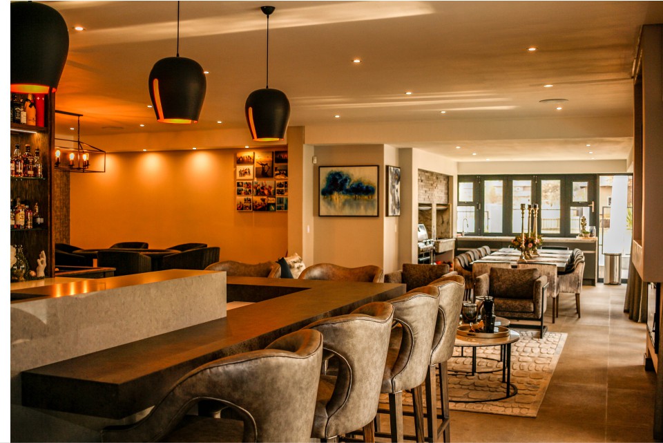
The design approach was to create a modern sanctuary for a young couple with a very busy lifestyle. The couple wanted a contemporary house that was easy to maintain but also easy to entertain in as they regularly have friends and family over. The brief was for an open plan living area, compact but spacious with a large outside patio to utilize the warm, sunny days of South Africa. A granny flat at the bottom which could function on its own if a client stays over and private bedrooms and pyjama lounge on the first floor.
It was important to take in the surrounds and the views the estate the house is situated in but also keeping privacy in mind.
The design was placed to Southern boundary, as close to the entrance road as possible, so that there will be a large garden to the North to act as a privacy buffer between them and their neighbours. The high entrance volume created by the concrete roof slab and steel columns accentuate the entrance and foyer. Here a separation of functions happens, to the West (left) the garages and granny flat and to the East (right) the open plan living space with service functions to the back.
The stairs to the first floor are also situated at this movement area.
On the first floor the three bedrooms are all en-suite and the main bedroom is spacious with a dressing room. The bedrooms all open up to views of the surrounds and the pyjama lounge leads to sun downer balcony – this space is also served with a small kitchenette, perfect for entertaining.
The different areas and functions of the spaces are visible on plan as well as on façade and clean, modern design was created to capture the client’s needs. Harmony between the private and public spaces are achieved by the placement and separations of functions but also on a sustainable level with large overhangs on the roof as needed with solar shading incorporated but also solar screens as needed. A pool leads of the patio for a calming and cooling effect on the house with a pond and waterfalls to capture the movement and serenity of water. This water feature forms a focal point as one enters the residence but is visible from the open plan living area. The large windows and top clearstory allow for an abundance of natural light to enter the house, the clearstory giving a soft, filtered light into the bedrooms.


MENDONCA FAMILY
LOFT DUPLEX DEVELOPMENT (MULTI-RESIDENTIAL)
Klerksdorp
Read More
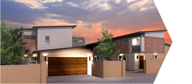
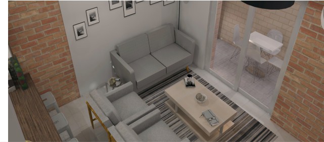
As with the previous project, the client wanted to develop cost effective housing for young people, specifically young professionals. The client wanted to maximise the ground usage to entail a sustainable development of a row one-bedroom loft units and larger two-bedroom unit to scale down in eventually. The one-bedroom units can be individually owned by each person to the developmental scheme, but the larger unit stays with the main developer. Each unit is to be rented out for an income to the development with dividends to be shared. Thus, creating an investment opportunity as well within the development. The one-bedroom units are 42 square meters in size with a small open-plan living area, scullery and guest toilet. First floor has the bedroom, bathroom, balcony and a small study space. Outside patio is done cost-effectively with gum poles to create a pergola with translucent sheeting.
Even though the size is small, the units still feel spacious and cater for the tenants needs. This would in turn yield a high Return on Investment for the owners of the unit and the developer.
To make the design more breathable and sustainable, small patios are incorporated in the all the units. This is to cool down the design but also a socialization space for each tenant. The clearstory windows in the loft bedrooms allows for privacy from the surrounding flatlets but also for natural light penetration.
The material palette is contained to face brick, ceramic tiles, steel, gum poles for pergolas and carports, roof tiles and fibre cement cladding to differentiate the different functions and articulate the different materials used. Interior is also kept to a minimum of materials to ensure low maintenance costs but also low construction costs.



MENDONCA FAMILY
TOWNHOUSE DEVELOPMENT (MULTI-RESIDENTIAL)
Klerksdorp
Read More
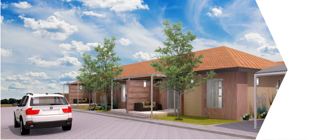
The designs brief was to develop cost effective housing for young people or people who needed a more affordable housing solution. The client wanted to maximise the ground usage to entail a sustainable development of rows or blocks of housing. These blocks could be owned by individual persons or groups, with units rented out within each block. Thus, creating an investment opportunity as well within the development. The design was done on the premises of four, two-bedroom units with two bathrooms per block. These units are 64 square meters in size with a small open-plan living area and scullery. There is a small patio at the entrance and a kitchen yard at the back. Even though the size is small, the units still feel spacious and cater for the tenants needs. This would in turn yield a high Return on Investment for the owners of the unit and the developer. The project will be implemented over phases, with phase one to have five blocks.
To make the design more breathable and sustainable, green belts are designed along movement corridors that lead to past the blocks. This is to cool down the design but also to create a social communal space between neighbouring units. On the end of each movement corridor, a green space is made to be shared between the different blocks where the tenants can relax and unwind. Water storage tanks that is below the ground level, is used to collect grey water that is recycled and re-used to wet the gardens in the development.
The material palette is contained to face brick, ceramic tiles, steel and roof tiles. Interior is also kept to a minimum of materials to ensure low maintenance costs but also low construction costs.



LEPHALALE HEIGHTS
(MULTI-RESIDENTIAL)
Ellisras/Lephalale
In conjunction with Conradie and Greyvensteyn Architects
Read More
The designs brief was to develop cost effective housing for young people or people who needed a more affordable housing solution. The client wanted to maximise the ground usage to entail a sustainable development of rows or blocks of housing. The design was done on the premises of two-bedroom units with two bathrooms. These units are 114 square meters in size with a small open-plan living area. There is a small patio for each unit and a carport/garage. On the first floor is two bedrooms with two bathrooms. Even though the size is small, the units still feel spacious and cater for the tenants needs. There are 56 units in total. This would in turn yield a high Return on Investment for the owners of the developer.
To make the design more breathable and sustainable, green belts are designed in between the central unit blocks as communal gardens but also as a green buffer and breathing space.
On both end rows there is a strip communal garden along the perimeter walls.
The gardens are to cool down the design but also to create a social communal space between neighbouring units. Water storage tanks that is below the ground level, is used to collect grey water that is recycled and re-used to wet the gardens in the development.
The material palette is contained to face brick, plaster panels with paint, stone cladding, ceramic tiles, steel and roof tiles. Interior is also kept to a minimum of materials to ensure low maintenance costs but also low construction costs. Large overhangs keep the summer sun at bay, the patios are recessed into the space to create a sheltered and private space. The gables are used to show entrances but also so as to create a sense or feel of knowing or belonging as it pays homage to the archetypal house that we all know.


HOSPITALITY DESIGNS
BOUTIQUE HOTEL
CHATU KHANYI TRUST
Klerksdorp
Read More
The mall management contacted the firm with an open brief to design a new space within the existing building and mall fabric. The space is currently used as a pop-up retail space.
The proposal was for a new Seattle Coffee Company retail space, combined with a book and newspaper retailer. The space is on a movement node from the parking area, green park, movie theatre, restaurants and entrance to the mall. The green park area in front of the premises covers the visibility there off from the road and parking area. This had to be addressed.
The existing building is closed off to the public passing by, there for the concept proposed that a new glassed area be developed where people could go and relax, do some work, have a meeting, keep an eye on the kids while they play in the proposed play area and rock-climbing wall, or just catch-up with a friend with people passing by.
The main entrance is extended with an outside seating area, lowered screens to add human scale, shading but also to orientate the public as the main entrance.
A new secondary entrance is also created for people who pass from the other side or the proposed new kids playing area and rock-climbing wall. Both entrances area highlighted with a skeletonized metal portal A-frame. This frame is softened with a green plant inset in-between the frames; this also doubles as a shading device and echoes the green park in front of the premises. On top of the portal frame, signage is placed on the very top of the frame to address the visibility from the parking area and road as mentioned earlier.
Interior wise the look will be stripped down, industrial in essence with lounge areas and so forth to fit into the concept of a Seattle Coffee Company store.
Due to financial constraints the Mall did not continue with the proposal.


COMMERCIAL DESIGNS
ROCKVILLE SQUARE
Klerksdorp
In conjunction with Conradie and Greyvensteyn Architects
Read More
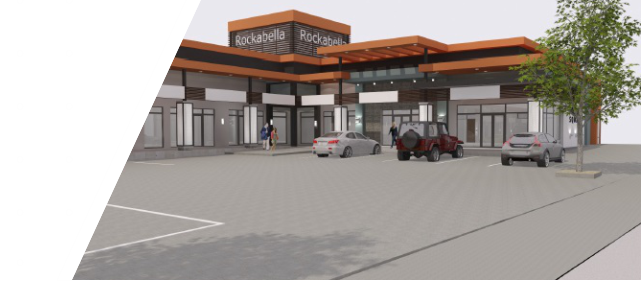
Rockville Square is a redesign of an existing commercial development. The clients gave us a clean brief in the sense that they wanted a unique modern design and to extend the development with a second phase increasing commercial space.
We stripped off the original façade and altered as needed to create a gallery or promenade in front of the shopping spaces. The promenade was to have a large sweeping roof continuing through out the design, skeletonized only on the centres of the wrap around. Here a lower roof is in place, to cover the entrances. The promenade roof accentuates the U-shape of the design, but also gives a sense of movement in the design with the layering effect of the roofs.
Louvers are used as sun control methods but also to take the signage of the different shops.
Skeletonized columns hold the sweeping promenade roof in place, the columns are wrapped in cut steel motif that light up in the evenings – caressing the promenade with a soft light.
The corner tower houses the main office of the developer’s own premises, a space to break-away in but also to give a datum to the design, almost a pivot in the design.



MINTY FAMILY TRUST
PROPOSED DEVELOPMENT
Klerksdorp
Read More
The two proposals differ in style and layout, this is as a result of the different functions it could house.
The first proposal was modern take on industrial warehousing with a commercial retail outlet incorporated. Originally it was designed for two tenants who each needed a large commercial space for their respective businesses. The concept was for storage at the back with centralized delivery, retail at the front on street level and offices on the first/mezzanine level. Human scale was kept in mind and so the roofs where designed as a cubing coming down to ground floor ceiling height – this also created advertisement space and accentuated the entrances. Materials chosen was also in line with an industrial feel.
The second proposal was for more shop space to increase the Return on Investment rate. The overall design is modular in nature and can be easily constructed. The internal spaces can easily be adjusted as necessary to the tenants needs and a mezzanine level could be added effortlessly to increase floor space. A restaurant space was designed in the middle to cater for the public and tenants. The concept was to create a chic industrial commercial design that can be changed effortlessly and people can use as high design space as this is a palette for creation, in essence to be a design quarter with different services.
Materials chosen was for cost of construction, ease of construction, quality but affordable finish.


SEATTLE COFFEE
COMPANY PROPOSAL
Mooirivier Mall, Potchefstroom
Read More
The mall management contacted the firm with an open brief to design a new space within the existing building and mall fabric. The space is currently used as a pop-up retail space.
The proposal was for a new Seattle Coffee Company retail space, combined with a book and newspaper retailer. The space is on a movement node from the parking area, green park, movie theatre, restaurants and entrance to the mall. The green park area in front of the premises covers the visibility there off from the road and parking area. This had to be addressed.
The existing building is closed off to the public passing by, there for the concept proposed that a new glassed area be developed where people could go and relax, do some work, have a meeting, keep an eye on the kids while they play in the proposed play area and rock-climbing wall, or just catch-up with a friend with people passing by. The main entrance is extended with an outside seating area, lowered screens to add human scale, shading but also to orientate the public as the main entrance.
A new secondary entrance is also created for people who pass from the other side or the proposed new kids playing area and rock-climbing wall. Both entrances area highlighted with a skeletonized metal portal A-frame. This frame is softened with a green plant inset in-between the frames; this also doubles as a shading device and echoes the green park in front of the premises. On top of the portal frame, signage is placed on the very top of the frame to address the visibility from the parking area and road as mentioned earlier.
Interior wise the look will be stripped down, industrial in essence with lounge areas and so forth to fit into the concept of a Seattle Coffee Company store.
Due to financial constraints the Mall did not continue with the proposal.



OFFICE DESIGNS
GWK HEAD OFFICES AND OFFICE PARK
Kimberley
In conjunction with Conradie and Greyvensteyn Architects
Read More
GWK is a large role player in the agricultural sector and decided to move their main office base from a small town, Douglas to Kimberley in the Northern Cape. This new office base is more centrally located in their distribution area and network.
The brief stated that there should be one large office building to house the CEO, different managers and staff with boardroom spaces. Three smaller office buildings to house the secondary staff services and IT and the third to rent out. Phase two will consist of more office buildings, varying to the needs of the development.
The offices are on a main National route, so the design was a flagship for the new era of GWK and what they stood for, having a clear strong image in the agricultural environment.
Sustainable design, correctly orientated, large overhangs and using a borehole and recycled water in the design.


INSTITUTIONAL DESIGNS
NORTH-WEST UNIVERSITY
PHARMACEUTICAL & LIFE SCIENCE FACULTIES
Potchefstroom Campus
In conjunction with Conradie and Greyvensteyn Architects
Read More
The university lodged a design competition and the entry we submitted was chosen as the winning design. The brief was to house two distinct faculties in one building. There was to be a basement and four stories above ground. Each wing was to be a faculty housing their specific needs. There was to be centralised circulation and ablutions that the faculties would share.
After we took the design brief and the very different needs of the faculties into account, we designed two independent buildings for each faculty. Each building was to house the different departments on independent floors with offices, multi-functional lecture rooms, media/computer rooms, laboratories and practical evaluation rooms. The deans of the faculties were also to be housed in their respective new faculty buildings.
The design is inspired by modern contemporary architecture but also pays homage to the surrounding campus buildings in terms of scale and design, for example the triangular bay windows on the Western entrance façade. This façade is the most prominent as its greats one as you enter the square before the faculties and circulation area. A large perforated metal screen shields the staircase from harsh Western sun, this is echoed by a louvered screen on the Eastern elevation that screens the building from morning sun exposure.
Louvers are further utilized to shield the Northern windows from summer sun as well as to hide service shafts for the Life Sciences Faculty on its Southern side.
The NWU Business School & Governance is one of the top schools in the country. We were given the opportunity to propose a new design for them. Unfortunately, the funding did not materialise and so the project came to a halt before we could begin with construction.
The design was so that a large reception foyer from where one could circulate to the cafeteria, large auditorium that could be rented out and lecture rooms with break-away spaces and a large library and media/computer room. Also, the rentable office space could be entered from here which was the main circulation space. This space is open with a high volume, so that there is a visual connection to all the floors.
The two wings are orientated to the North, with offices, lecture rooms and break-away spaces all placed on the North side of the building. Services, laboratories, practical halls and so on are placed to the South so as to have minimal sun exposure and heat gain. Further, solar studies were done to ensure maximum shade levels in the summer time with shade screen slabs protruding from the floor slabs and maximum exposure in the winter time for solar heat gain to make the building more cost effective to run. The courtyard is wide enough that even the ground floor has natural light penetrating the building. The courtyard acts as a social space for students to gather and relax.
The design was shortlisted for publication by the Department of Higher Education for a book on architecture in the 20 years of democracy in South Africa.


NORTH-WEST UNIVERSITY
LAW FACULTY
Mafikeng Campus
In conjunction with Conradie en Greyvensteyn Architects
Read More
The university granted the Law Faculty a new building as the previous building was insufficient to meet their needs. The university’s brief was to develop a building where the faculty could be housed with all the departments under one roof. Further it was to have a research library with student consultation rooms and boardroom for them to use.
The second wing of the building was to have three multi-purpose lecture rooms that the campus can use as well, a media/computer room and a mock court room. Circulation was centralised with public ablutions at the lecture rooms.
Solar control was achieved with vertical and horizontal louvers over openings and services are housed on the flat concrete roof. The materials chosen was also for ease of maintenance as steel were powder coated, plaster panels done with Marmoran coatings and face brick.
Human scale was achieved by lowering the height of the roofs over pedestrian circulation areas, thus achieving a more tactile sense of scale and belonging but also highlighting circulation routes.


NORTH-WEST UNIVERSITY
BUSINESS SCHOOL
Potchefstroom Campus
In conjunction with Conradie en Greyvensteyn Architects
Read More
The NWU Business School & Governance is one of the top schools in the country. We were given the opportunity to propose a new design for them. Unfortunately, the funding did not materialise and so the project came to a halt before we could begin with construction.
The design was so that a large reception foyer from where one could circulate to the cafeteria, large auditorium that could be rented out and lecture rooms with break-away spaces and a large library and media/computer room. Also, the rentable office space could be entered from here which was the main circulation space. This space is open with a high volume, so that there is a visual connection to all the floors.
On the first floor is the director’s office with staff and other break-away spaces and offices.
Also, a planted roof that can be used as an entertaining space for the Business School.
The second floor has the rest of the management offices and a large multi-functional boardroom space. This boardroom can be rented by the offices or outside public.
The material palette is so that the design is cost effective, sustainable and maintenance free. Face brick, off-shutter concrete, steel frame work, aluminium panels and louvers with Marmoran plaster panels.


